Calculate the Warming Stripes from ERA5#
This notebook demonstrates how to retrieve, process, and plot the data displayed in the ERA Explorer
==> For further training materials, consider the Copernicus Climate Change Service (C3S) data tutorials
In this example we will be using earthkit to retrieve the data and standard Python packages to process and plot it.
import numpy as np
import pandas as pd
import matplotlib.pyplot as plt
from matplotlib.colors import ListedColormap, BoundaryNorm
from matplotlib.ticker import MultipleLocator
import earthkit.data
If you want to run this code yourself, make sure to get a CDS API key from the CDS website.
Following the guidance there, you’ll then need to set up your local .cdsapirc to be able to authenticate with the CDS and download data. Then, you will be able to customise the date ranges, variables, and much more!
This is the latitude/longitude that we will extract the nearest grid cell from. You can change these to plot different locations. You can see the currently used ones in the ERA Explorer URL. In this example we are plotting data at the gridpoint closest to Brussels, Belgium.
lat = 50.86
lng = 4.35
This is the variable we are getting from the ERA dataset, and the time period
variable = "2m_temperature"
date_range = ["1940-01-01", "2024-12-31"]
For convenience, we make a function to handle the data retrieval:
def retrieve_data(variable, date_range, lat, lng):
    # Define the dataset and request parameters
    dataset = "reanalysis-era5-single-levels-timeseries"
    request = {
        "variable": [
        variable,  # Variable to retrieve
        ],
        "date": date_range,  # Date range for the data
        "location": {"longitude": lng, "latitude": lat},  # Location coordinates
        "data_format": "netcdf"  # Format of the retrieved data
    }

    # Use "earthkit" to retrieve the data
    ekds = earthkit.data.from_source(
        "cds", dataset, request
    ).to_xarray()

    return ekds
Get the data. This will download a NetCDF file
data = retrieve_data(variable, date_range, lat, lng)
And let’s make some bespoke functions to process the data. Each one is described with a “””docstring”””
def truncate_data(var):
# Create a range of the final hours of each year in the dataset
start_year = var.valid_time.dt.year.min().item()
end_year = var.valid_time.dt.year.max().item()
final_hours = pd.date_range(f"{start_year}-12-31T23:00:00",
f"{end_year}-12-31T23:00:00",
freq="YE")
# Filter only the years where the final hour is in the dataset
valid_years = [dt.year for dt in final_hours if dt in var.valid_time]
# Select data for those years
var_truncated =var.sel(
valid_time=var.valid_time.dt.year.isin(valid_years)
)
return var_truncated
# Make a function to compute the warming stripes
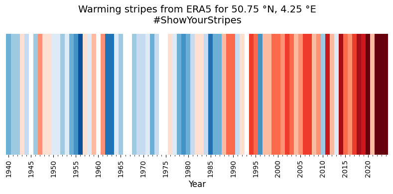
def warmingStripes():
"""
Generates warming stripes data based on temperature anomalies.
This function processes temperature data to generate warming stripes,
which are visual representations of temperature anomalies over time.
The data is normalized and resampled to annual means,
and anomalies are calculated relative to a climatology period.
Returns:
tuple: A tuple containing:
- years (list): List of years corresponding to the temperature data.
- stripes_values (numpy.ndarray): Normalized temperature anomalies
for each year.
"""
clim_year_stripes_start = 1961
clim_year_stripes_end = 2010
norm_stripes_start = 1940
norm_stripes_end = 1999
climatology_period_stripes = slice('{:d}-01-01'.format(clim_year_stripes_start),
'{:d}-12-31'.format(clim_year_stripes_end))
# Not the same as the clim period
normalisation_period_stripes = slice('{:d}-01-01'.format(norm_stripes_start),
'{:d}-12-31'.format(norm_stripes_end))
data_t2m_pt = data.t2m
# Remove incomplete year
data_t2m_pt_trun = truncate_data(data_t2m_pt)
# Resample the data to annual means
data_t2m_pt_agg = data_t2m_pt_trun.resample(valid_time="YE").mean()
years = data_t2m_pt_agg.valid_time.to_index().year.tolist()
# Calculate the standard deviation for normalization
data_t2m_pt_agg_std = data_t2m_pt_agg.sel(
valid_time=normalisation_period_stripes).std()
scaling = (data_t2m_pt_agg_std * 3.0)
# Calculate climatology and anomalies
data_t2m_pt_agg_clim1 = data_t2m_pt_agg.sel(
valid_time=climatology_period_stripes).mean()
data_t2m_pt_agg_anom1 = data_t2m_pt_agg - data_t2m_pt_agg_clim1
data_t2m_pt_agg_anom_norm1 = data_t2m_pt_agg_anom1 / scaling
stripes_values = data_t2m_pt_agg_anom_norm1.values
# Get the actual lat/lon used
nearest_lat = data_t2m_pt.latitude.values
nearest_lng = data_t2m_pt.longitude.values
return years, stripes_values, nearest_lat, nearest_lng
# Call our function
years1, ts1, nearest_lat, nearest_lng = warmingStripes()
And finally, let’s set up the plot nicely. This can easily be customised, but for now we do something similar to ERA Explorer
# Set line width and marker properties for potential customization
lw = 2
marker = 'o'
markersize = 4

# Determine the suffix for latitude (N/S) and longitude (E/W) based on their signs
latSuffix = 'N' if nearest_lat > 0 else 'S'
lngSuffix = 'E' if nearest_lng > 0 else 'W'

# Define a custom color palette with a white center for warming stripes
stripeColorsWhiteCentre = [
    '#08306b', '#08519c', '#2171b5', '#4292c6',
    '#6baed6', '#9ecae1', '#c6dbef', '#deebf7', '#ffffff',
    '#fee0d2', '#fcbba1', '#fc9272', '#fb6a4a',
    '#ef3b2c', '#cb181d', '#a50f15', '#67000d',
]

# Define the range of data values and create a colormap using the custom palette
vmin, vmax = -1, 1
cmap = ListedColormap(stripeColorsWhiteCentre)

# Normalize data to match the number of colors in the palette
norm = BoundaryNorm(
    boundaries=np.linspace(
        vmin - 0.01, vmax + 0.01, len(stripeColorsWhiteCentre) + 1
    ),
    ncolors=len(stripeColorsWhiteCentre),
    clip=True
)

# Create a new figure with a specified size
plt.figure(figsize=(8, 4))

# Map the data values (ts1) to colors, clamping values outside the range [-1, 1]
colors = cmap(norm(np.clip(ts1, vmin, vmax)))

# Plot the data as horizontal bars for each year with no edge color
plt.bar(
    years1,
    height=1,
    width=1.0,
    color=colors,
    align='center',
    edgecolor='none'
)

# Customize the x-axis ticks to appear every 5 years for clarity
plt.xticks(np.arange(1940, 2100, 5), rotation=90)

# Set x-axis limits slightly beyond the first and last years for better spacing
plt.xlim(years1[0] - 0.5, years1[-1] + 0.5)

# Remove the y-axis ticks and labels to emphasize the visual stripes
plt.gca().yaxis.set_visible(False)

# Add an x-axis label and a title with geographic and campaign information
plt.xlabel('Year', fontsize=12)
latlon = (
    f'{abs(nearest_lat):.2f} °{latSuffix}, '
    f'{abs(nearest_lng):.2f} °{lngSuffix}'
    )
plt.title(
    f'Warming stripes from ERA5 for {latlon}\n#ShowYourStripes',
    fontsize=14
)

# Add minor x-axis ticks for every year to improve granularity
plt.gca().xaxis.set_minor_locator(MultipleLocator(1))

# Remove plot spines (borders) for a clean, minimalist look
for spine in plt.gca().spines.values():
    spine.set_visible(False)

# Adjust layout to ensure all elements fit within the figure boundaries
plt.tight_layout()

# Display the plot
plt.show()